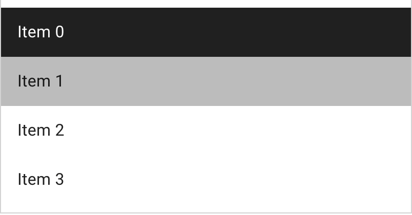
<mwc-list> 
IMPORTANT: The Material Web Components are a work in progress and subject to
major changes until 1.0 release.
Lists are continuous, vertical indexes of text or images.

Material Design Guidelines: lists
Demo
Installation
npm install @material/mwc-list
NOTE: The Material Web Components are distributed as ES2017 JavaScript
Modules, and use the Custom Elements API. They are compatible with all modern
browsers including Chrome, Firefox, Safari, Edge, and IE11, but an additional
tooling step is required to resolve bare module specifiers, as well as
transpilation and polyfills for IE11. See
here
for detailed instructions.
Example usage
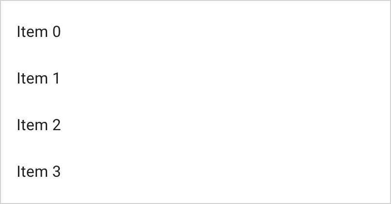
Basic

<mwc-list>
  <mwc-list-item>Item 0</mwc-list-item>
  <mwc-list-item>Item 1</mwc-list-item>
  <mwc-list-item>Item 2</mwc-list-item>
  <mwc-list-item>Item 3</mwc-list-item>
</mwc-list>

<script type="module">
  import '@material/mwc-list/mwc-list.js';
  import '@material/mwc-list/mwc-list-item.js';
</script>
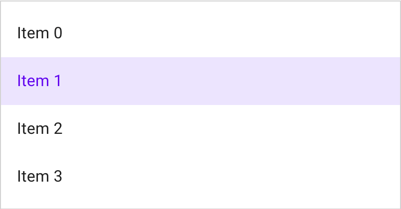
Activatable

<mwc-list activatable>
  <mwc-list-item>Item 0</mwc-list-item>
  <mwc-list-item selected activated>Item 1</mwc-list-item>
  <mwc-list-item>Item 2</mwc-list-item>
  <mwc-list-item>Item 3</mwc-list-item>
</mwc-list>
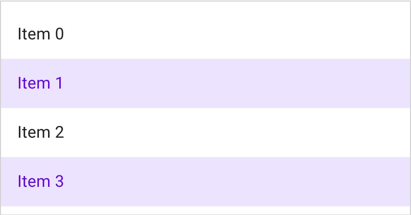
Multi-selectable (activatable)

<mwc-list activatable multi>
  <mwc-list-item>Item 0</mwc-list-item>
  <mwc-list-item selected activated>Item 1</mwc-list-item>
  <mwc-list-item>Item 2</mwc-list-item>
  <mwc-list-item selected activated>Item 3</mwc-list-item>
</mwc-list>
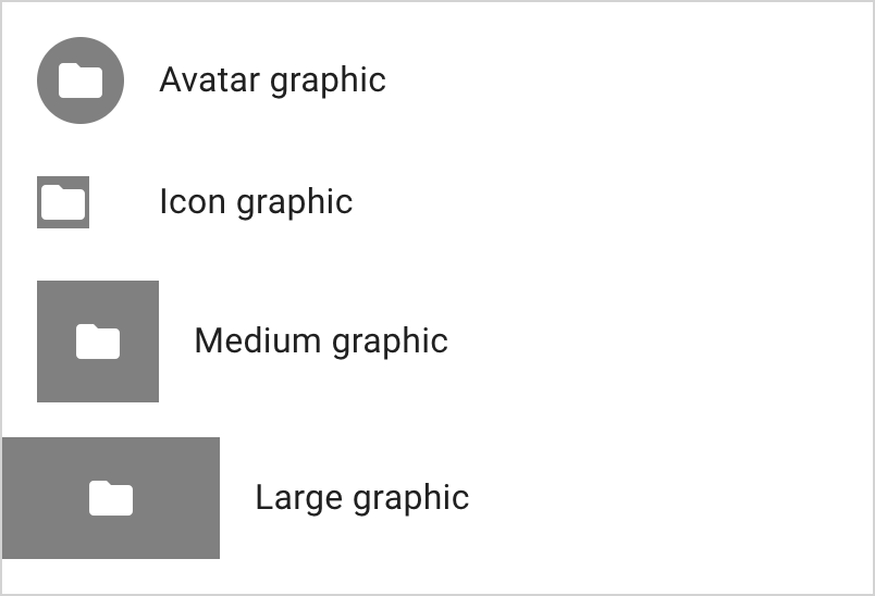
Leading Graphic
Note: it is not recommended to mix graphic sizes in the same list.

<style>
mwc-icon {
background-color: gray;
color: white;
}
</style>
<mwc-list>
<mwc-list-item graphic="avatar">
<span>Avatar graphic</span>
<mwc-icon slot="graphic">folder</mwc-icon>
</mwc-list-item>
<mwc-list-item graphic="icon">
<span>Icon graphic</span>
<mwc-icon slot="graphic">folder</mwc-icon>
</mwc-list-item>
<mwc-list-item graphic="medium">
<span>medium graphic</span>
<mwc-icon slot="graphic">folder</mwc-icon>
</mwc-list-item>
<mwc-list-item graphic="large">
<span>large graphic</span>
<mwc-icon slot="graphic">folder</mwc-icon>
</mwc-list-item>
</mwc-list>
<script type="module">
import '@material/mwc-list/mwc-list-item.js';
import '@material/mwc-list/mwc-list.js';
import '@material/mwc-icon';
</script>
Meta Icon
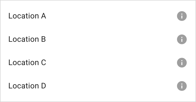
<mwc-list>
  <mwc-list-item hasMeta>
    <span>Location A</span>
    <mwc-icon slot="meta">info</mwc-icon>
  </mwc-list-item>
  <mwc-list-item hasMeta>
    <span>Location B</span>
    <mwc-icon slot="meta">info</mwc-icon>
  </mwc-list-item>
  <mwc-list-item hasMeta>
    <span>Location C</span>
    <mwc-icon slot="meta">info</mwc-icon>
  </mwc-list-item>
  <mwc-list-item hasMeta>
    <span>Location D</span>
    <mwc-icon slot="meta">info</mwc-icon>
  </mwc-list-item>
</mwc-list>
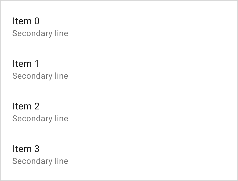
Two-Line

<mwc-list>
  <mwc-list-item twoline>
    <span>Item 0</span>
    <span slot="secondary">Secondary line</span>
  </mwc-list-item>
  <mwc-list-item twoline>
    <span>Item 1</span>
    <span slot="secondary">Secondary line</span>
  </mwc-list-item>
  <mwc-list-item twoline>
    <span>Item 2</span>
    <span slot="secondary">Secondary line</span>
  </mwc-list-item>
  <mwc-list-item twoline>
    <span>Item 3</span>
    <span slot="secondary">Secondary line</span>
  </mwc-list-item>
</mwc-list>
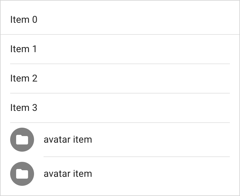
Dividers
Dividers must have the divider attribute and it is recommended to add
role="separator" for screen readers. There are 3 variants of dividers,
full-width (default), padded (respects list padding), and inset (left-padding
respects avatar and icon paddding). These variants can be mixed.

<mwc-list>
  <mwc-list-item>Item 0</mwc-list-item>
  <li divider role="separator"></li>
  <mwc-list-item>Item 1</mwc-list-item>
  <li divider padded role="separator"></li>
  <mwc-list-item>Item 2</mwc-list-item>
  <li divider padded role="separator"></li>
  <mwc-list-item>Item 3</mwc-list-item>
  <li divider padded role="separator"></li>
  <mwc-list-item graphic="avatar">
    <span>avatar item</span>
    <mwc-icon slot="graphic">folder</mwc-icon>
  </mwc-list-item>
  <li divider inset padded role="separator"></li>
  <mwc-list-item graphic="avatar">
    <span>avatar item</span>
    <mwc-icon slot="graphic">folder</mwc-icon>
  </mwc-list-item>
</mwc-list>
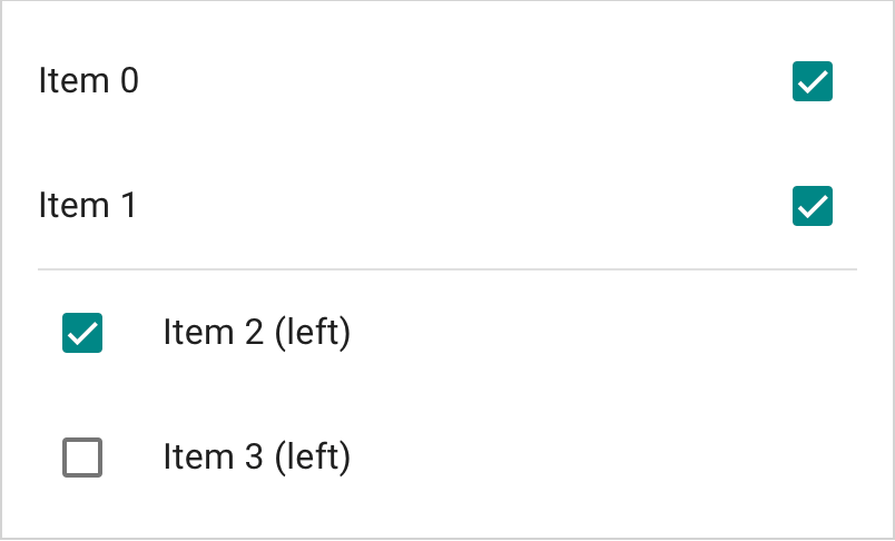
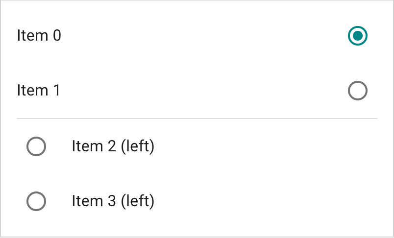
Checklist
mwc-check-list-item inherits from mwc-list-item, so it will share a similar
API to mwc-list-item.

<mwc-list multi>
  <mwc-check-list-item selected>Item 0</mwc-check-list-item>
  <mwc-check-list-item selected>Item 1</mwc-check-list-item>
  <li divider role="separator" padded></li>
  <mwc-check-list-item left selected>Item 2 (left)</mwc-check-list-item>
  <mwc-check-list-item left>Item 3 (left)</mwc-check-list-item>
</mwc-list>

<script type="module">
  import '@material/mwc-list/mwc-check-list-item.js';
  import '@material/mwc-list/mwc-list.js';
</script>
Radio List
mwc-radio-list-item inherits from mwc-list-item, so it will share a similar
API to mwc-list-item.
Setting group on the radio-list-item will group those mwc-radios together
across the same Document.

<mwc-list>
  <mwc-radio-list-item group="a" selected>Item 0</mwc-radio-list-item>
  <mwc-radio-list-item group="a">Item 1</mwc-radio-list-item>
  <li divider padded role="separator"></li>
  <mwc-radio-list-item left group="a">Item 2 (left)</mwc-radio-list-item>
  <mwc-radio-list-item left group="a">Item 3 (left)</mwc-radio-list-item>
</mwc-list>
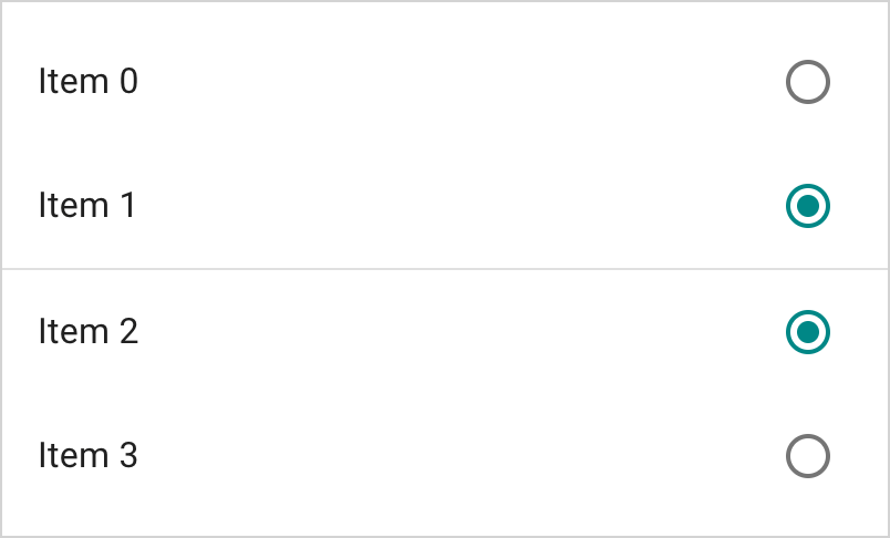
Multi Radio List
A radio list can also have multi.

<mwc-list multi>
  <mwc-radio-list-item group="b">Item 0</mwc-radio-list-item>
  <mwc-radio-list-item group="b" selected>Item 1</mwc-radio-list-item>
  <li divider role="separator"></li>
  <mwc-radio-list-item group="c" selected>Item 2</mwc-radio-list-item>
  <mwc-radio-list-item group="c">Item 3</mwc-radio-list-item>
</mwc-list>
<script type="module">
  import '@material/mwc-list/mwc-radio-list-item.js';
  import '@material/mwc-list/mwc-list.js';
</script>
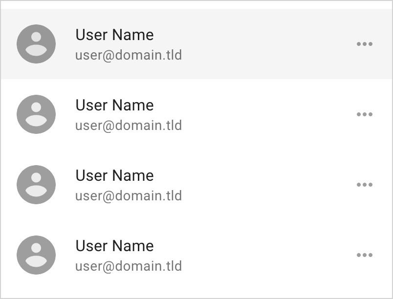
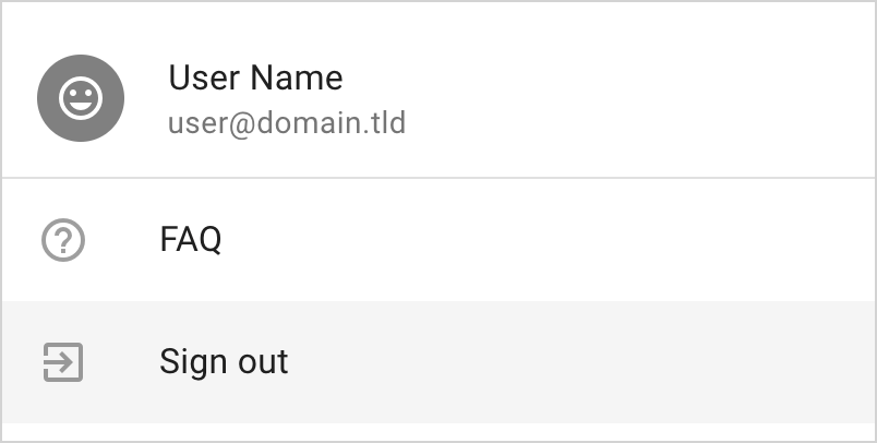
Item Noninteractive
Setting a list-item to non-interactive will disable focus and pointer events on
the item, and it will no longer be considered for selection.

<style>
  .inverted {
    background-color: gray;
    color: white;
  }
</style>
<mwc-list>
  <mwc-list-item twoline graphic="avatar" noninteractive>
    <span>User Name</span>
    <span slot="secondary">user@domain.tld</span>
    <mwc-icon slot="graphic" class="inverted">tag_faces</mwc-icon>
  </mwc-list-item>
  <li divider role="separator"></li>
  <mwc-list-item graphic="icon">
    <slot>FAQ</slot>
    <mwc-icon slot="graphic">help_outline</mwc-icon>
  </mwc-list-item>
  <mwc-list-item graphic="icon">
    <slot>Sign out</slot>
    <mwc-icon slot="graphic">exit_to_app</mwc-icon>
  </mwc-list-item>
</mwc-list>
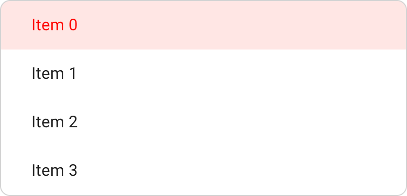
Styled

<style>
  #styled {
    --mdc-theme-primary: red;
    --mdc-list-vertical-padding: 0px;
    --mdc-list-side-padding: 30px;
    border-radius: 10px;
    overflow: hidden;
  }
</style>
<mwc-list activatable id="styled">
  <mwc-list-item selected>Item 0</mwc-list-item>
  <mwc-list-item>Item 1</mwc-list-item>
  <mwc-list-item>Item 2</mwc-list-item>
  <mwc-list-item>Item 3</mwc-list-item>
</mwc-list>
Styled No-ripple
For more-control on styling, you may want to disable the ripple. Internally
list-item uses mwc-ripple. You can make the ripple invisible using its
custom properties detailed in mwc-ripple's documentation. In this case,
it may be simple to just set --mdc-ripple-color to transparent.

<style>
#styledr {
--mdc-ripple-color: transparent;
}
#styledr > * {
transition: background-color .2s, color .2s;
}
#styledr [selected] {
background-color: rgb(33, 33, 33);
color: white;
}
#styledr [mwc-list-item]:not([selected]):hover,
#styledr [mwc-list-item]:not([selected]):focus {
background-color: rgba(33, 33, 33, 0.3);
}
#styledr [mwc-list-item]:not([selected]):active {
background-color: rgba(33, 33, 33, 0.4);
}
#styledr [mwc-list-item][selected]:hover,
#styledr [mwc-list-item][selected]:focus {
background-color: rgba(33, 33, 33, 0.9);
}
#styledr [mwc-list-item][selected]:active {
background-color: rgba(33, 33, 33, 0.8);
}
</style>
<mwc-list id="styledr">
<mwc-list-item selected>Item 0</mwc-list-item>
<mwc-list-item>Item 1</mwc-list-item>
<mwc-list-item>Item 2</mwc-list-item>
<mwc-list-item>Item 3</mwc-list-item>
</mwc-list>
API
Slots
mwc-list
| Name | Description |
|---|
| default | Content to display in the lists internal <ul> element. |
mwc-list-item
| Name | Description |
|---|
graphic | First tile graphic to display when graphic attribute is defined. |
meta | Last tile meta icon or text to display when hasMeta is true. |
secondary | Secondary text displayed below primary text of a two-line list item. |
| default | Primary text to display in the list item. Note, text must be wrapped in an inline node to be styled for disabled variant. |
Properties/Attributes
mwc-list
| Name | Type | Default | Description |
|---|
activatable | boolean | false | Sets activated attribute on selected items which provides a focus-persistent highlight. |
rootTabbable | boolean | false | When true, sets tabindex="0" on the internal list. Otherwise sets tabindex="-1". |
multi | boolean | false | When true, enables selection of multiple items. This will result in index being of type Set<number> and selected returning ListItemBase[]. |
wrapFocus | boolean | false | When true, pressing up on the keyboard when focused on the first item will focus the last item and down when focused on the last item will focus the first item. |
itemRoles | string|null | null | Determines what role attribute to set on all list items. |
innerRole | string|null | null | Role of the internal <ul> element. |
noninteractive | boolean | false | When true, disables focus and pointer events (thus ripples) on the list. Used for display-only lists. |
items | ListItemBase[] (readonly)* | [] | All list items that are available for selection. Eligible items have the [mwc-list-item] attribute which ListItemBase applies automatically. |
selected | SelectedType (readonly)* | null | Currently-selected list item(s). When multi is true, selected is of type ListItemBase[] and when false, selected is of type ListItemBase. selected is null when no item is selected. |
index | MWCListIndex (readonly)** | -1 | Index / indices of selected item(s). When multi is true, index is of type number and when false, index is of type Set<number>. Unset indicies are -1 and empty Set<number> for single and multi selection respectively. |
* SelectedType is equivaalent to type ListItemBase|ListItemBase[]|null.
ListItemBase is the base class of mwc-list-item of which both
mwc-check-list-item and mwc-radio-list-item also inherit from.
** MWCListIndex is equivalent to type number|Set<number>.
mwc-list-item
| Name | Type | Default | Description |
|---|
value | string | '' | Value associated with this list item (used by mwc-select). |
group | string|null | null | Used to group items together (used by mwc-menu for menu selection groups and mwc-radio-list-element). |
tabindex | number | -1 | Reflects tabindex and sets internal tab indices. |
disabled | boolean | false | Reflects disabled and sets internal disabled attributes. |
twoline | boolean | false | Activates the two-line variant and enables the secondary slot. |
activated | boolean | false | Activates focus-persistent ripple. |
graphic | GraphicType* | null | Determines which graphic layout to show and enables the graphic slot. |
multipleGraphics | boolean | false | Allows arbitrary width for multiple slotted graphics. |
hasMeta | boolean | false | Activates the meta layout tile and enables the meta slot. |
noninteractive | boolean | false | Disables focus and pointer events for the list item. |
selected | boolean | false | Denotes that the list item is selected. |
text | string (readonly) | '' | Trimmed textContent of the list item. |
* GraphicType is equivalent to the type
'avatar'|'icon'|'medium'|'large'|'control'|null.
mwc-check-list-item
Note: mwc-check-list-item inherits from ListItemBase which is the base class
of mwc-list-item, so all properties in mwc-list-item will be available on
mwc-check-list-item.
| Name | Type | Default | Description |
|---|
left | boolean | false | Displays the checkbox on the left. Overrides graphic. |
graphic | GraphicType* | 'control' | Determines which graphic layout to show and enables the graphic slot when value is not control or null. |
* GraphicType is equivalent to the type
'avatar'|'icon'|'medium'|'large'|'control'|null.
mwc-radio-list-item
Note: mwc-radio-list-item inherits from ListItemBase which is the base class
of mwc-list-item, so all properties in mwc-list-item will be available on
mwc-radio-list-item.
| Name | Type | Default | Description |
|---|
left | boolean | false | Displays the checkbox on the left. Overrides graphic. |
graphic | GraphicType* | 'control' | Determines which graphic layout to show and enables the graphic slot when value is not control or null. |
group | string|null | null | Used to group the internal mwc-radios together (also used by mwc-menu for selection groups). |
* GraphicType is equivalent to the type
'avatar'|'icon'|'medium'|'large'|'control'|null.
Methods
| Name | Description |
|---|
select(index: MWCListIndex) => void | Selects the elements at the given index / indices. |
toggle(index: number, force?: boolean) => void | Toggles the selected index, and forcibly selects or deselects the value of force if attribtue is provided. |
getFocusedItemIndex() => number | Returns the index of the currently-focused item. -1 if none are focused. |
focusItemAtIndex(index) => void | Focuses the item at the given index and manages tabindex on all other items. |
layout(updateItems = true) => void | Resets tabindex on all items and will update items model if provided true. It may be required to call layout if selectability of an element is dynamically changed. e.g. [mwc-list-item] attribute is removed from a list item or noninteractive is dynamically set on a list item. |
Events
mwc-list
| Event Name | Target | Detail | Description |
|---|
action | mwc-list | ActionDetail* | Fired when a selection has been made via click or keyboard aciton. |
selected | mwc-list | SelectedDetail** | Fired when a selection has been made. index is the selected index (will be of type Set<number> if multi and number if single), and diff (of type IndexDiff**) represents the diff of added and removed indices from previous selection. |
* ActionDetail is an interface of the following type:
interface ActionDetail {
  index: number;
}
** SelectedDetail is an interface of the following type:
interface SelectedDetail<T extends MWCListIndex = MWCListIndex> {
  index: T;
  diff: T extends Set<number> ? IndexDiff: undefined;
}
** IndexDiff is an interface of the following type:
interface IndexDiff {
  added: number[];
  removed: number[];
}
It may be easier to use SelectedEvent which is of type
SingleSelectedEvent|MultiSelectedEvent.
SingleSelectedEvent is of type CustomEvent<SelectedDetail<number>>
MultiSelectedEvent is of type CustomEvent<SelectedDetail<Set<number>>>
If you listen for a selected event you may be able to use the following
pattern:
import '@material/mwc-list';
import {isEventMulti} from '@material/mwc-list';
const onSelected = (evt: SelectedEvent) => {
if (isEventMulti(evt)) {
...
} else {
...
}
};
mwcList.addEventListener('selected', onSelected);
mwc-list-item
| Event Name | Target | Detail | Description |
|---|
request-selected | mwc-list-item | RequestSelectedDetail* | Fired upon click and when selected property is changed. Requests selection from the mwc-list. |
* RequestSelectedDetail is an interface of the following type:
interface RequestSelectedDetail {
  selected: boolean;
  source: 'interaction'|'property';
}
mwc-check-list-item
| Event Name | Target | Detail | Description |
|---|
request-selected | mwc-list-item | RequestSelectedDetail | Fired upon click. Requests selection from the mwc-list. |
mwc-radio-list-item
| Event Name | Target | Detail | Description |
|---|
request-selected | mwc-list-item | RequestSelectedDetail | Fired upon click and on internal mwc-radio's checked event. Requests selection from the mwc-list. |
CSS Custom Properties
mwc-list
| Name | Default | Description |
|---|
--mdc-theme-text-primary-on-background |  rgba(0, 0, 0, 0.87) | Color of the primary text. |
--mdc-list-vertical-padding | 8px | Padding before and after the first and last list items. |
--mdc-list-side-padding | 16px | Adjusts the padding of the [padded] list dividers (also propagates to mwc-list-item). |
--mdc-list-inset-margin | 72px | Adjusts the left inset padding of an [inset] list divider. Typically used for dividing list items with icons. |
mwc-list-item
| Name | Default | Description |
|---|
--mdc-theme-primary |  #6200ee | Color of the activated ripple and primary text color when activated. |
--mdc-theme-on-surface |  #000 | Disabled text color |
--mdc-theme-text-icon-on-background |  rgba(0, 0, 0, .38) | Color of the graphic icon (if graphic is text icon). |
--mdc-theme-text-primary-on-background |  rgba(0, 0, 0, .87) | Color of the primary text if not activated. |
--mdc-theme-text-secondary-on-background |  rgba(0, 0, 0, .54) | Color of the secondary text if not activated. |
--mdc-theme-hint-on-background |  rgba(0, 0, 0, .38) | Color of the meta (if is text or text icon). |
--mdc-list-side-padding | 16px | Side padding of the list item. |
--mdc-list-item-meta-size | 24px | Line height of the meta icon or text and width & height of the slotted parent wrapper. |
--mdc-list-item-graphic-size | 24px,40px,56px | Line height of the graphic and width & height of the slotted parent wrapper. 24px when graphic is "icon". 40px when graphic is "avatar". 56px when graphic is "medium", and "large". |
--mdc-list-item-graphic-margin | 16px,32px | Margin between the text and graphic. 16px when graphic is "avatar", "medium", "large", and "control". 32px when graphic is "icon". |
mwc-list-item internally uses mwc-ripple
and thus exposes all of the custom properties in mwc-ripple's documentation
with the exception of --mdc-ripple-color being overriden as
--mdc-theme-primary when mwc-list-item is activated.
Additional references


